We know we shouldn’t judge a book by its cover — but let’s face it, we absolutely do.
Covers are no longer just protective wrappers for precious pages — they’re a book’s first impression, its billboard, and in many cases, its best shot at grabbing a reader's attention in a crowded market. And in today’s image-driven world, where scrolling is the new browsing, design doesn’t just matter — it sells.
But how did we get here? And what makes a cover not just good, but irresistible?
The history of the book jacket looks vastly different from the illustrated, foil-embossed, laminated marvels that dominate shelves today. Originally created as a simple dust protector, the early book cover was minimal — occasionally a title on the spine, perhaps a small illustration, and little else. But back then, it didn’t matter. Readers weren’t choosing books by their covers — they were choosing them by reputation, author, or word of mouth.
Fast forward to now: with thousands of new titles released daily and bookstores (virtual or physical) overflowing, the cover has become a critical piece of marketing real estate. In a publishing world saturated with choice, the stories inside must fight harder to be noticed — and it starts with the cover.
A wealth of literature exists on the psychology of colour in design — and it turns out, our brains are compulsively drawn to specific imagery, even when we don’t realise it. Naturally, this applies to how we choose our next read.
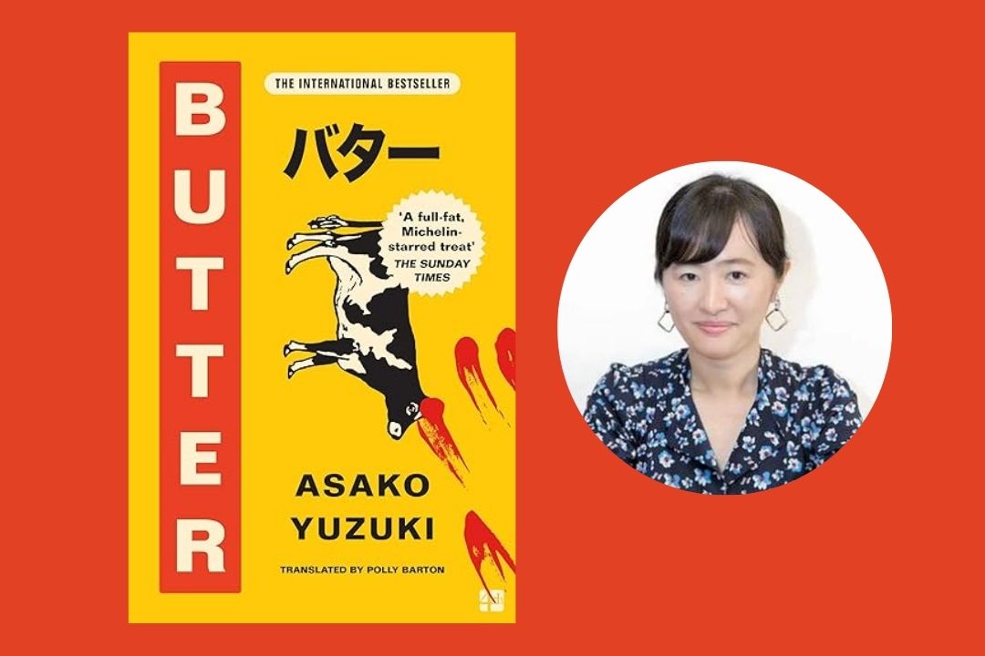
Take the recent Japanese bestseller Butter by Asako Yuzuki. Its cover — a rich yellow backdrop featuring a horizontal cow, stylised Japanese text, and a smudged blood-red fingerprint — is an odd visual contradiction. And it works. The yellow promises lightness, the fingerprint hints at darkness, and the cow... well, it's butter, isn’t it? The intrigue of this odd combination draws the eye — and the curiosity.
This clever use of visual juxtaposition is a rising trend: covers that clash just enough to make you pause, think, and maybe flip to the blurb.
Typography is just as powerful. A curly, romantic script shouts “rom-com.” A scratched, jagged font screams “horror.” Serif fonts feel classic, sans-serif feels clean, modern. The typeface isn’t just decoration — it sets the emotional tone before a single word is read.
Pair that with genre-informed imagery — dragons and swords for epic fantasy, minimalist pastels for literary fiction, bold neon for speculative thrillers — and you’ve got a cover that doesn’t just catch attention, it communicates.
With cover design becoming more vital than ever, we’re seeing an interesting split. Some publishers are going maximalist — layering rich textures, vibrant colours, and gold foiling to stand out. Others are rebelling by going back to basics — crisp fonts, solid backgrounds, and a whisper of illustration, echoing the classic Penguin aesthetic.
Both work. Both sell. The trick is knowing your audience — and how you want your book to feel before it’s ever opened.
Paperbacks continue to thrive, despite the digital tide. Why? Because a well-designed book doesn’t just hold a story — it is a story. A beautiful cover invites touch, display, and pride of ownership. It becomes part of the reader’s identity.
So whether you’re an author, publisher, or reader, don’t underestimate the power of the cover. In today’s saturated market, it’s not just the first impression — it might be the only one.
.jpg)